What image sizes should you use on your quiz landing page?


If you want high-quality leads, you need a high-quality landing page with good imagery.
Promoting your quiz is a lot easier if you have high-quality, relevant images on your quiz landing page.
If your images are poor quality, your visitors will notice, and if your images are too small, then the layout of your page might look strange.
It’s important to take your time to find the right images in the correct dimensions so that your quiz landing page encourages people to take part.
In this article, I’m going to give you the exact dimensions for all the different images you might place on your landing page.
Note…
You might notice that the image sizes below are larger than they need to be. This is to ensure that the photographs and icons remain high-quality no matter what device is used to view them.
Normally, large images cause your website to load more slowly, however, we automatically compress the images for you so that your landing pages still load quickly but still look fantastic.
If you’re not using ScoreApp for your landing page then you will want to use a third-party tool like TinyPNG to reduce the file size before uploading images to your website or landing page.
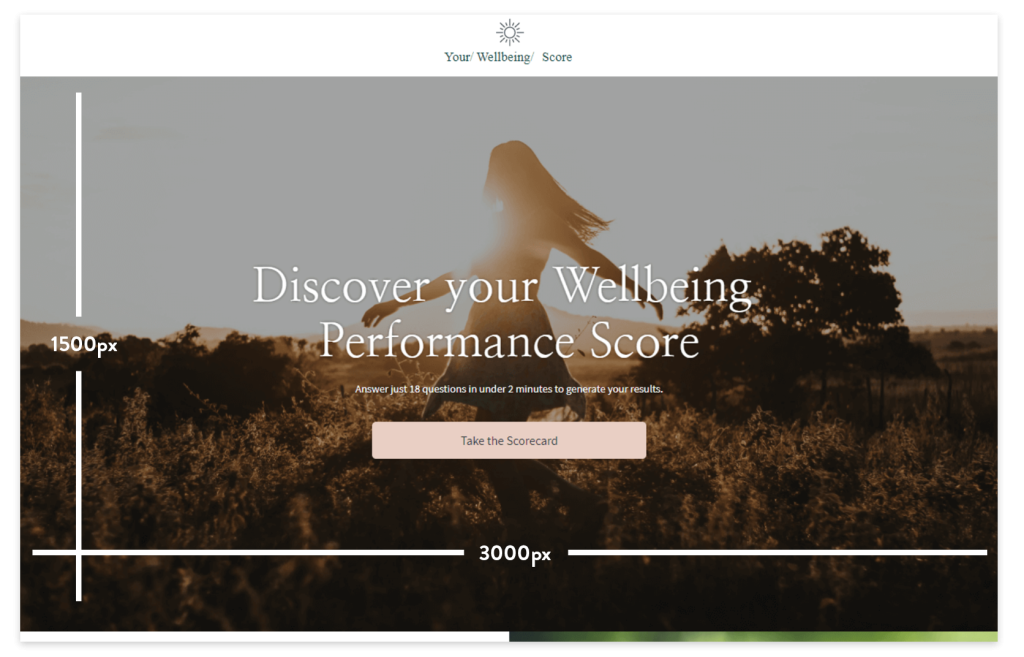
Hero image – full width (3000px by 1500px)
Your hero image is the main image you display when someone lands on your quiz landing page. It’s above the fold, which means a high-quality image can have an immediate impact. If you’re using a wide cover image that stretches the full width of your page, then 3000px wide is the perfect size. The height will usually be determined by the content within that section e.g. Headings, content, buttons etc. But as a guide, 1500px will usually be good.

3000px by 1500px (2:1) Landscape
How to create a full-width hero image
If you can’t find an image that’s the right size, head over to Canva and create a new document using the “custom size” button on the home screen after you log in.
Enter 3000px by 1500px, and then add your image. You might lose the top and bottom of the image, but that’s ok. Just move the image around until you’re happy the main parts of the image are visible. If the image is cut off too much and it doesn’t look right, you might need to use another image that’s more landscape friendly.
Hero image tip
With full-width hero images, it’s sometimes best to add a colour overlay to your image. Try making the transparency 50% so that the text on top of the image pops and doesn’t get lost in the background. Just adjust the transparency to suit you. You can do this in Canva if you like, but you can also add a colour overlay directly in ScoreApp if you’re using our tool to build your landing page.
Hero image – half width (1500px by 1500px)
If you are using a half-page hero image, then 1500px by 1500px is the perfect size. The image is still very important as it’s the first image someone will see when they arrive at your quiz landing page. Some landing pages use standard square images in the hero section, and others might use vector graphics and illustrations. Even if your graphics aren’t exactly square, the dimensions should still be around 1500by1500.

Half-page image tip
Make the image relevant to the quiz. It’s easy to put any image there to fill the space but try to find an image that compliments your quiz and the value it delivers.
For example, if it’s a finance quiz, then an image of a desk with a calculator would be relevant. If you have a “business success” quiz, then you might want an image of happy, successful business owners.
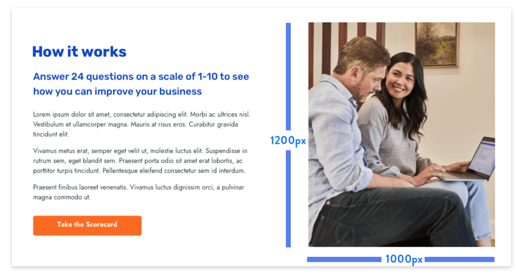
Portrait image- (1000px by 1200px)
Throughout your landing page, you may want to use portrait images. You’ll often see these next to text blocks on the left or the right or next to a lead form. A good size for these images would be 1000px wide by 1200 px tall.

Portrait image tip
If your image is a similar colour to the background, try adding a border or a shadow to see how it looks. It can often make a huge difference.
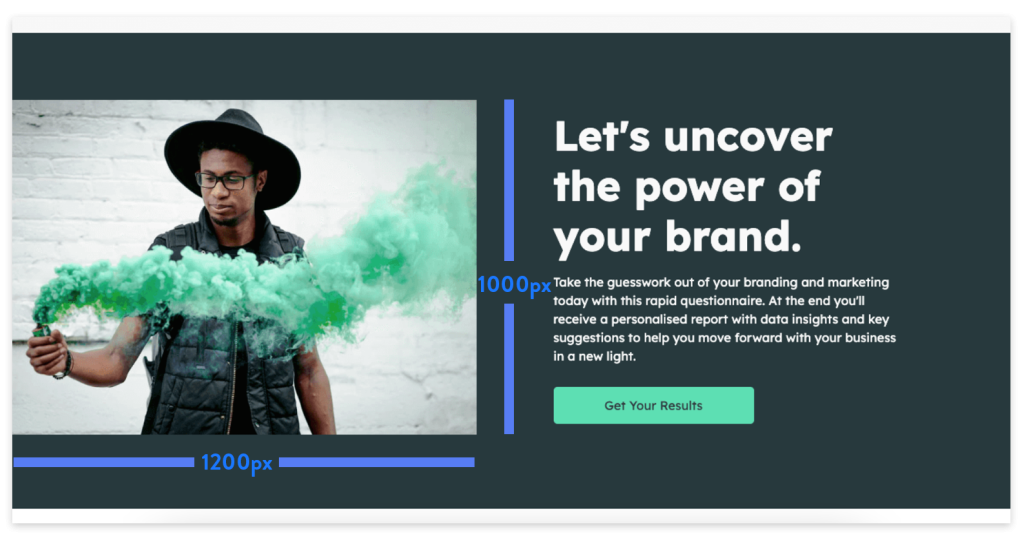
Landscape image – (1200px by 1000px)
Landscape images are also used across our quiz landing pages. Like portrait images, they often sit next to text blocks, bullet lists and lead forms.

Landscape images are the reverse of portrait images so 1000px wide by 1000px tall would be ideal.
Landscape image tip
Try to make the images relevant to the section of the page they are on. For instance, if your image is halfway down your landing page and you’re talking about yourself, make sure the image is of you. The same goes for the other sections of the page. Images should always match the content surrounding it.
Half-width block images (1500px by 1500px)
Some landing pages use half-width block photos that cover 50% of a section. There will usually be a text block beside it that also covers 50%.

These images should be 1500px wide by 1500px tall. However, the height of the image can increase or decrease depending on how much text you include in the text block beside it.
If you have a lot of text, the image will become taller, and if you only have a small amount of text, then the height will decrease. Just bare that in mind when choosing a photo for this section.
Half-width image tips
Try to use photographs rather than graphics in half-width block images as it tends to look far better. Graphics and illustrations often have white space around them, and it doesn’t generally look as good as standard images that fill the space.
Icons – (300px by 300px)
Who doesn’t love icons? Lots of landing pages use icons to highlight the features and benefits of their quiz. It’s typical to see 3-5 icons fairly high up on a landing page, and it’s a nice way to add something different rather than photo after photo.

If you’re using 4-6 icons in a row, then each icon would ideally be 300px by 300px. If you’re using 1-3 icons, then you might want to make the icons a little bigger such as 500px by 500px.
Where to find icons
You can use free icons that come as part of your quiz landing page builder, or you could look for premium icons using Icon Finder.

Icon tips
Try to make your icons all match a similar style. When you use a consistent style across all your icons, it looks much more professional.
Testimonial Headshots (300px by 300px)
Testimonials make your landing page much more believable and help you build more trust with your audience, especially if you include images of the reviewer.

Testimonial images should be 300px by 300px to keep the quality high. They might only be displayed as 100px by 100px, but it’s better to have high-quality images to be safe.
Testimonials Image tips
Try to make all the testimonial photos fit in a square or circle. You don’t want your images to be different shapes and sizes, as it will look strange and out of place.
Media Badges (500px by 300px)
Adding media badges or client logos to your quiz landing page adds more trust with your visitor, but you want to ensure you add the correct size logos.

Media badges are tricky. They are all completely different shapes and sizes, which means there is no perfect size; however, there is a way to make them look good regardless.
Head over to Canva and create a document 500px by 300px tall. You’ll want to use this same document for all your badges.
Download all of the logos and badges you want to use for your landing page and add them one by one to the Canva document. Make sure that the logo fills out the width fully and place it in the middle vertically centre (not too high, not too low)
When you do this, you can add any logo, no matter the size, and it will look good. Just keep it dead centre vertically and horizontally.
Media badge/logo tip
Try adding a colour overlay to each logo to make them all the same colour. You could use a light grey colour which means the logos are still visible, but they are subtle enough that they don’t draw attention away from the main goal of the page.
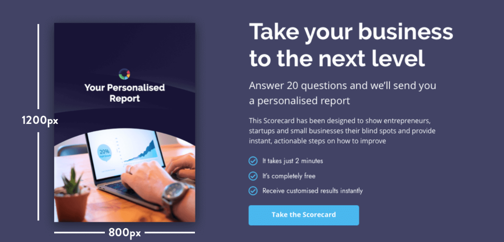
Book/report Images (800px by 1200px)
If you have a book or report that you’re giving away as part of your quiz then you probably want to showcase this on your landing page.
The book will need to be 800px wide by 1200px tall and placed next to a text block so you can explain what it is and why they should care.

Book/report image tip
Add a light drop shadow to your book/ report to make it stand out look more “physical”. Even if it’s a PDF report they’re getting, it still feels more tangible when you make it look real.
Summary
Now that you have all the correct measurements for your images, I’m sure you’ll be able to make your quiz landing page look outstanding. This will help you get more people to fill out your quiz and value your content so much more.
If you want more tips like this, check out our brand new quiz training centre and soak up all the tips, tricks and recourses.


